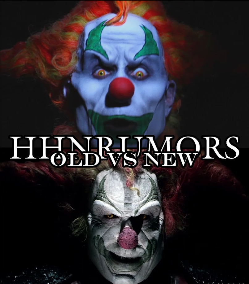
With Jack finally revealed, we can now begin the breakdown. Clearly Jack isn’t immune to aging and it doesn’t look good on him. As I mentioned in our brief spoiler post not long ago, Jack doesn’t look so hot. His face appears to have melted. I’d say the best comparison would be Jack Nicholson’s cartoonish version of the Joker vs Heath Ledger’s twisted take of the same character. Jack is/was a dark crazed clown, but now he’s gotten darker and appears even more deranged. Considering the teaser appears to be shot between some sound stages, it’s production quality is amazing and has me amped for the event!
We were also given the new logo!!! HHN logos haven’t been as prevalent since 2010. Typically just sticking with the HHN generic logo and adding the event number in a bloody font. This change was a good nod to the past. Can’t wait to see what else is in store! Oh yeah, 9 houses has also been confirmed!!! WOOO!!!!


